

v0.18.0
puckeditor/puckv0.18.0Jan 22, 2025by chrisvxd
AI Summary
A major feature release introducing a new drag-and-drop engine with CSS grid and flexbox support, along with UI improvements.
Key Highlights
- New drag-and-drop engine supporting CSS grid and flexbox
- Dynamic DropZone height that shrinks to children
- `cmd+i` hotkey to toggle interactivity in Preview mode
- New `<ActionBar.Label>` component for labeling action bars
Breaking Changes
- React 17 is no longer supported
- `Drawer` `direction` prop no longer has any effect
- DropZones are consistently wrapped in a div (previously Fragment in Render)
- `index` prop on `Drawer.Item` is no longer required
- `droppableId` prop on `Drawer` is no longer required
New Features
- New drag-and-drop engine (fluid layouts)
- `ActionBar.Label` component
- `cmd+i` hotkey and `previewMode` state
- `minEmptyHeight` prop for DropZone
- `inline` and `dragRef` APIs for removing wrappers
- Parent selector action in ActionBar
Full Release Notes
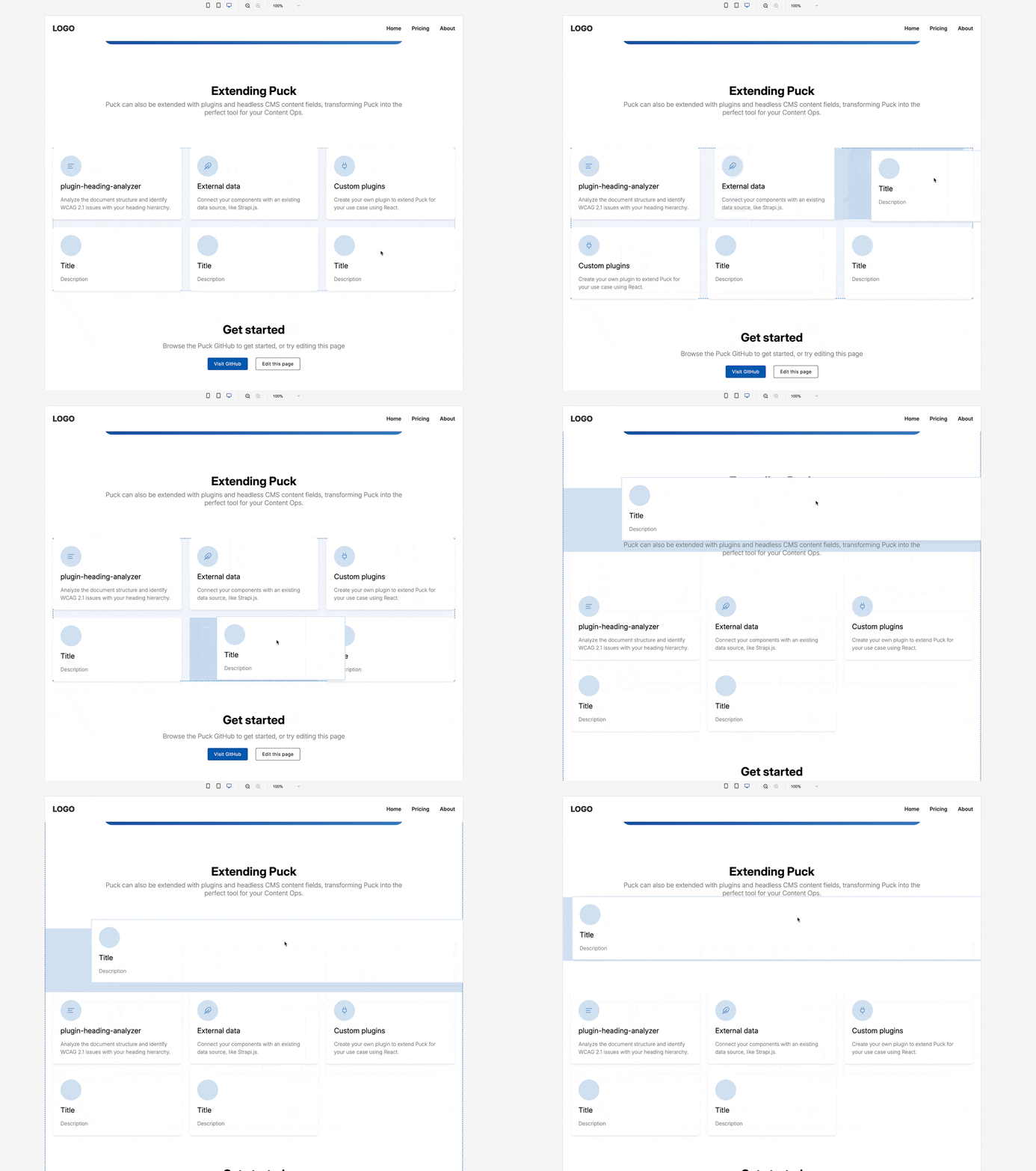
Puck 0.18 introduces a new drag-and-drop engine with native support for CSS grid and flexbox, enabling you to embed a design-in-browser experience directly within your React application or page builder.
## TLDR
- **New drag-and-drop engine**: Multi-dimensional drag-and-drop across any CSS layout to create a sophisticated page building experience. [Read the docs](https://puckeditor.com/docs/integrating-puck/multi-column-layouts).
- **Dynamic DropZone height**: DropZones now shrink to the height of their children, with a [configurable height](https://puckeditor.com/docs/api-reference/components/drop-zone#minemptyheight) when empty.
- **Toggle interactive hotkey**: Make your components interactive in Preview mode with the `cmd+i` hotkey.
- **Parent selector**: A new action allows you to quickly select the component's parent directly from the action bar.
- **No more `position: fixed`**: We've removed this pesky style from the default layout so it's easier to embed in your app.
- **New ActionBar.Label component**: Create sections in your action bar with the new [<ActionBar.Label> component](https://puckeditor.com/docs/api-reference/components/action-bar-label).
## Highlights
### New drag-and-drop engine
Our flagship feature is a new drag-and-drop engine for Puck with full CSS grid & flexbox support to enable advanced layouts. We call these **fluid layouts**, and they are fully backwards compatible.
Thanks to @clauderic at [dnd-kit](https://github.com/clauderic/dnd-kit/) for all the support in making this possible, and the Puck community for all the feedback! 🙏
#### Fluid layouts
To implement a fluid layout, add your display property of choice (e.g. `display: flex`) to your DropZone via the [`style`](https://puckeditor.com/docs/api-reference/components/drop-zone#style) or [`className`](https://puckeditor.com/docs/api-reference/components/drop-zone#classname) props and off you go—Puck will gracefully handle drag-and-drop across all dimensions.
```tsx
const config = {
components: {
Example: {
render: () => (
<DropZone
zone="my-content"
style={{ display: "flex" }} // Use flexbox in this DropZone
/>
),
},
Card: {
render: ({ text }) => (
<div>{text}</div>
),
},
},
};
```
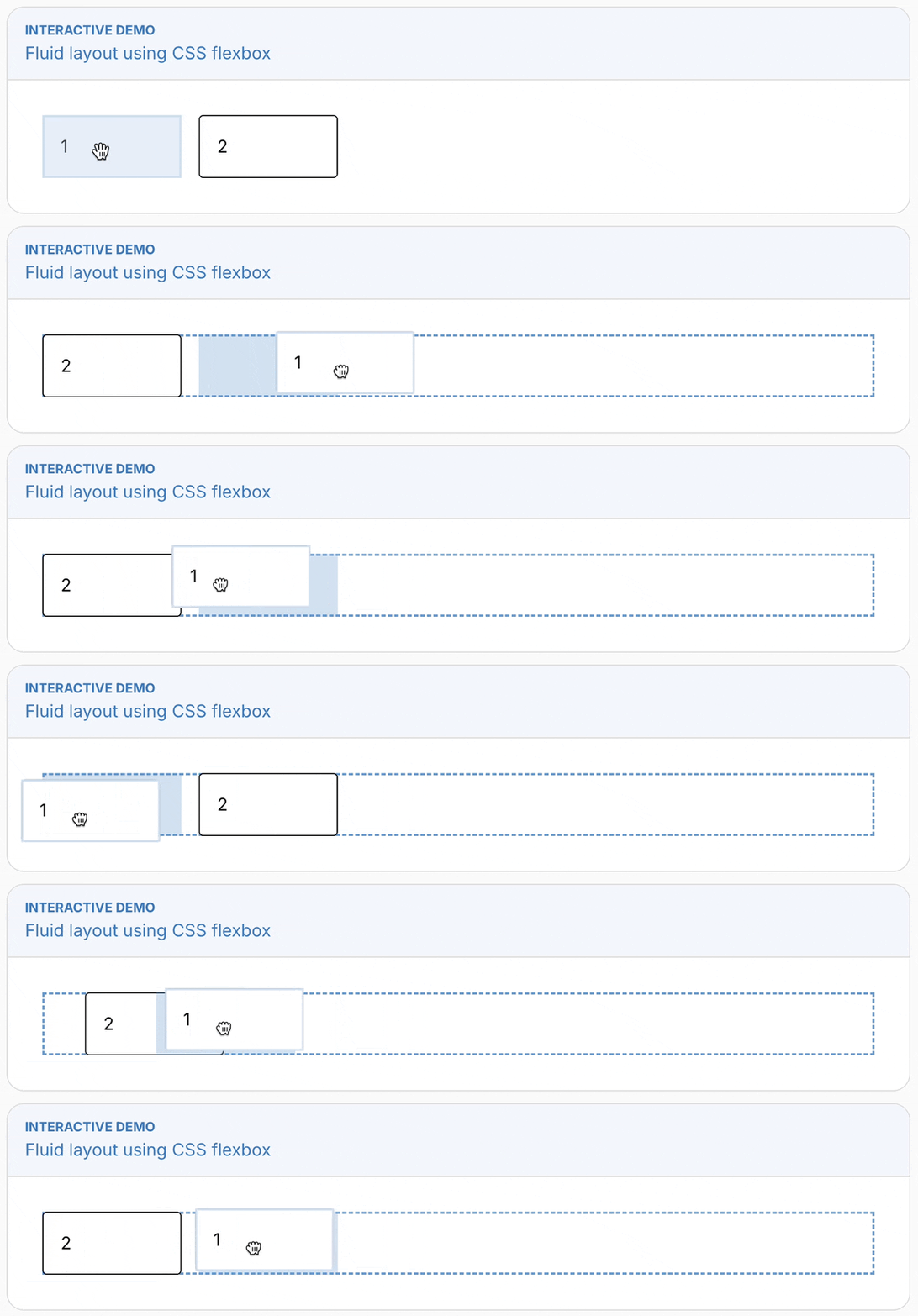
See the [Multi-column Layouts docs](https://puckeditor.com/docs/integrating-puck/multi-column-layouts) for the full documentation.
#### Remove wrapping elements
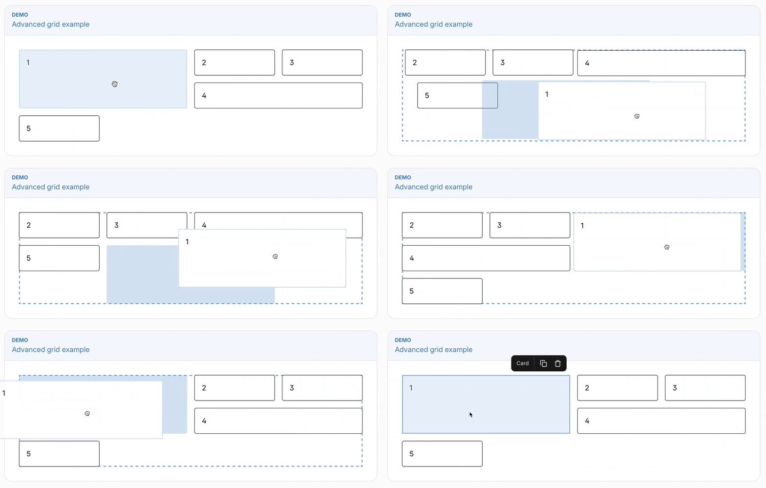
The new [`inline`](https://puckeditor.com/docs/api-reference/configuration/component-config#inline) and [`dragRef`](https://puckeditor.com/v/canary/docs/api-reference/configuration/component-config#puckdragref) APIs enable you to remove the wrapping element from Puck components entirely, which can be useful if you need to treat your component as a direct descendant of its parent (such as if you need to use CSS properties like `flex-grow`).
Here's an example implementing an advanced grid layout, where the children can specify their position using the `grid-column` and `grid-row` properties:
```tsx
const config = {
components: {
Example: {
render: () => (
<DropZone
zone="my-content"
style={{ display: "grid", gridTemplateColumns: "1fr 1fr 1fr 1fr" }} // Use CSS grid in this DropZone
/>
),
},
Card: {
inline: true, // Enable inline mode, removing the Puck wrapper
render: ({ text, puck }) => (
<div
ref={puck.dragRef} // Let Puck know this element is draggable
style={{ gridColumn: `span ${spanCol}`, gridRow: `span ${spanRow}` }} // Apply styles
>
{text}
</div>
),
},
},
};
```
#### Dragging between nested DropZones
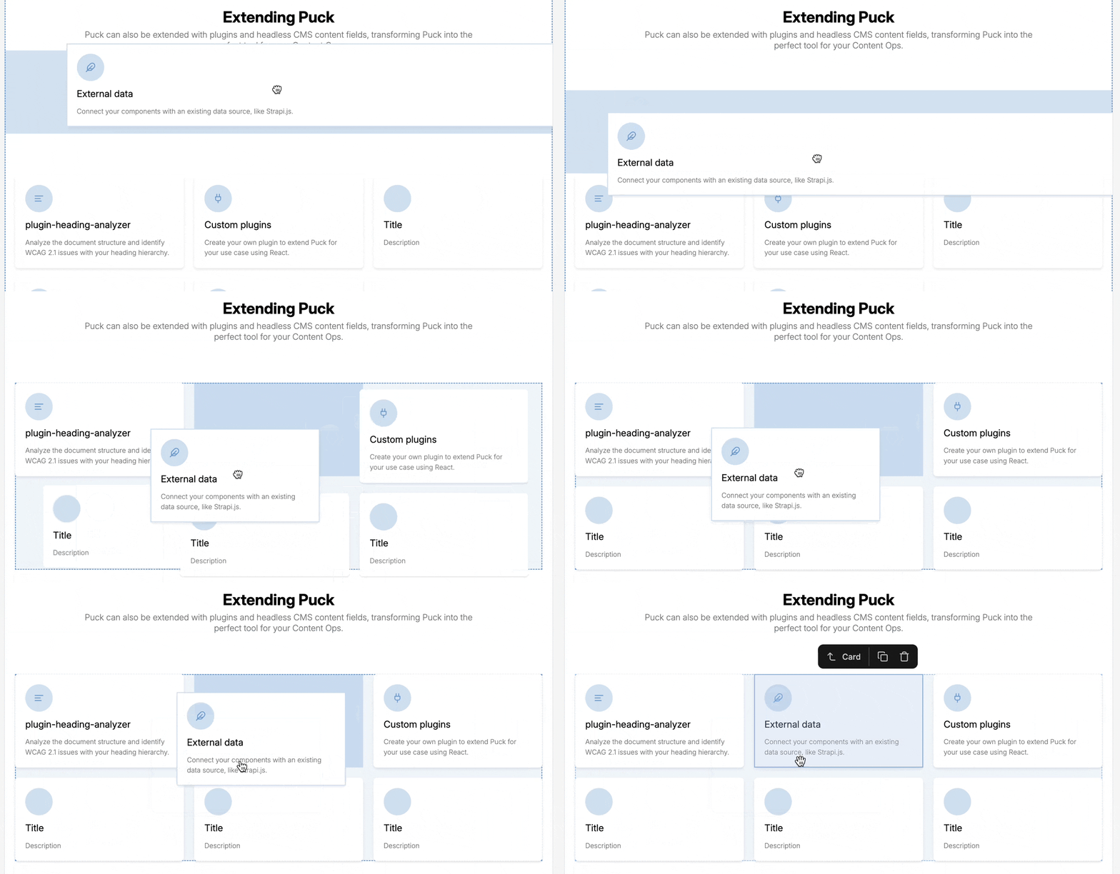
The new engine makes it possible to drag between nested DropZones, which resolves one of the longest standing limitations of Puck's drag-and-drop experience.
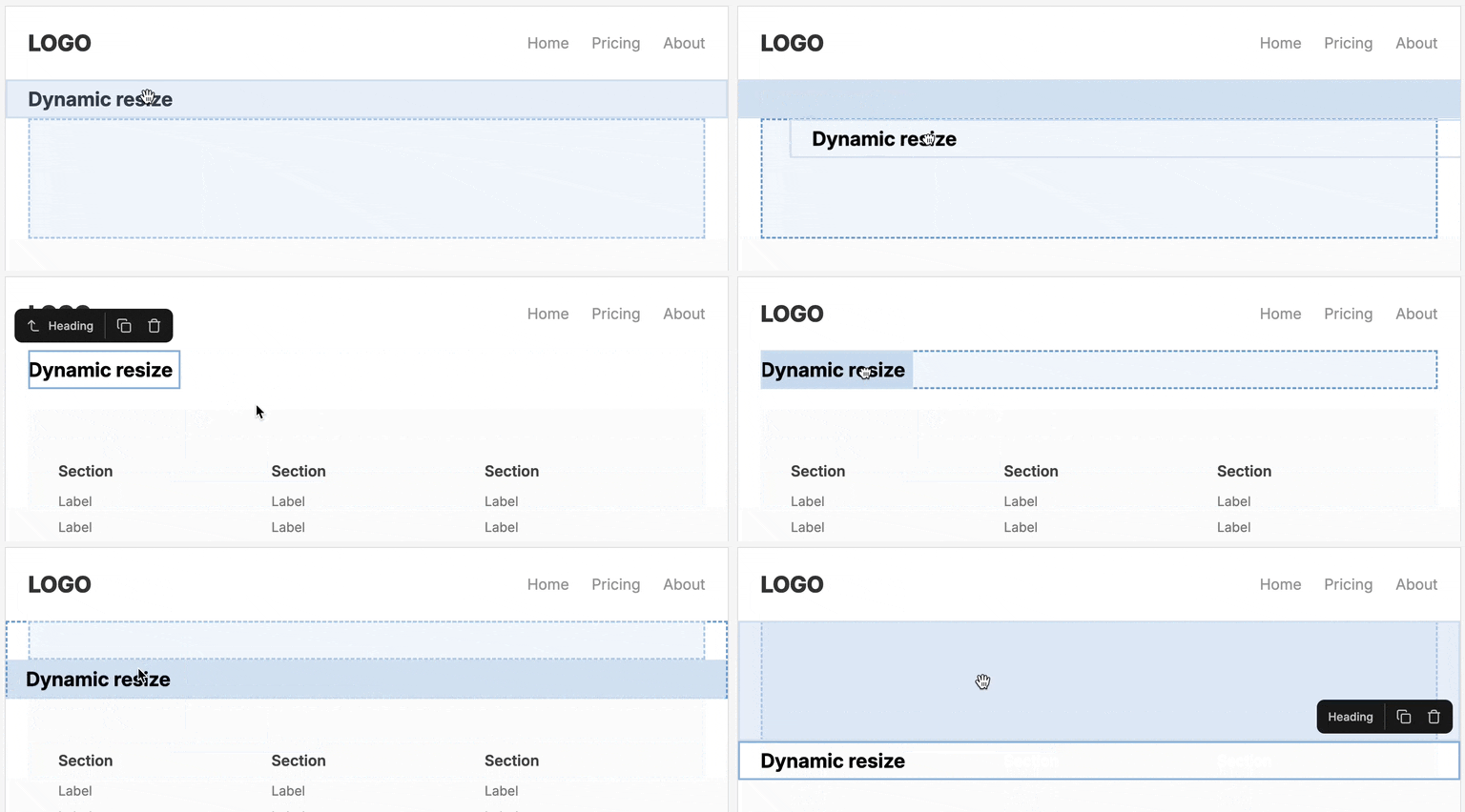
### Dynamic DropZone height
DropZones now shrink to the height of their children so that the preview is a faithful representation of the final output, with a new [configurable height](https://puckeditor.com/docs/api-reference/components/drop-zone#minemptyheight) when empty.
```tsx
<DropZone
zone="my-content"
minEmptyHeight={256} // The DropZone will grow to 256px when empty
/>
```
### The `<ActionBar.Label>` component
The new [`<ActionBar.Label>`](https://puckeditor.com/docs/api-reference/components/action-bar-label) component enables you to to label areas within a custom ActionBar:
```tsx
<ActionBar>
<ActionBar.Label label="Label 1" />
<ActionBar.Group>
<ActionBar.Label label="Label 2" />
<ActionBar.Action>★</ActionBar.Action>
</ActionBar.Group>
</ActionBar>
```
<img width="221" alt="image" src="https://res.cloudinary.com/die3nptcg/image/upload/v1752477141/403999884-79f7e5ac-1518-431b-99b6-e5ccdbae56f7_wyoymb.png" />
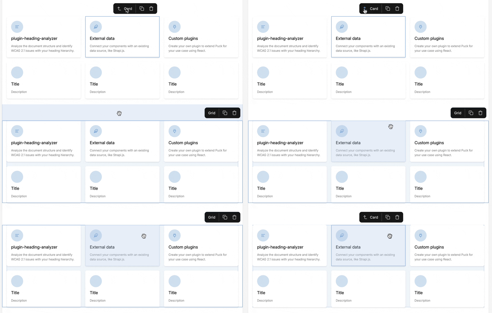
### Parent selector
A new action allows you to quickly select the component's parent directly from the action bar. Tap the arrow to the left of the component label to jump to the parent.
### Toggle interactive hotkey
Make your components interactive directly within Preview mode with the `cmd+i` (or `ctrl+i` on Windows) hotkey.
This can be programatically set via the new [`previewMode` parameter](https://puckeditor.com/docs/api-reference/app-state) on the app state.
### No more `position:fixed`
We've removed this pesky style from the default layout so it's easier to embed in your app. Not much to show here, but let's pour one out for `position:fixed` 🥂
## Breaking changes
### React 17 no longer supported
Due to upstream dependency changes, React 17 is no longer supported.
### Drawer `direction` no longer has any effect
The `direction` prop on `Drawer` no longer has any effect. Instead, use it to wrap a `div` with your chosen display mode:
```tsx
<Drawer>
<div style={{ display: "flex" }}>
<Drawer.Item name="Orange" />
</div>
</Drawer>
```
### DropZones are consistently wrapped in a div
Previously, DropZones were only wrapped in a div within the editor (`<Puck>`) environment, whereas the render (`<Render>`) environment used a fragment. This could result in unexpected rendering differences between environments.
Now, both environments use a div. If you were relying on the render environment behaving like a Fragment, you may need to adjust your styles. This can be done by applying your styles directly to the DropZone.
*Before*
```tsx
<div style={{ display: "flex" }}>
<DropZone zone="my-zone"> {/* Previously rendered as a fragment in <Render>, but div in <Puck> */}
<div>Item 1</div>
<div>Item 2</div>
</DropZone>
</div>
```
*After*
```tsx
<DropZone zone="my-zone" style={{ display: "flex" }}> {/* Now consistently renders as a div - apply your styles or class directly */}
<div>Item 1</div>
<div>Item 2</div>
</DropZone>
```
### Deprecations
* The `index` prop on `Drawer.Item` is no longer required and will be removed in a future version.
* The `droppableId` prop on `Drawer` is no longer required and will be removed in a future version.
## Full changelog
### Features
* add action to select parent component to ActionBar ([7c910d5](https://github.com/measuredco/puck/commit/7c910d5272e8d6d77819ccb3280dff143ea848fd))
* add ActionBar.Label component for adding labels to action bars ([d2645fd](https://github.com/measuredco/puck/commit/d2645fd68a57b4c07bb8a3948ab6a845c2ce1988))
* add DropZone collisionAxis API for forcing collision direction ([ba68732](https://github.com/measuredco/puck/commit/ba687329c6fac5085f78768bff6eb37bfd842f33))
* add meta+i hotkey and previewMode state to toggle interactivity ([ec1eba5](https://github.com/measuredco/puck/commit/ec1eba58525e0245ee1214f8e401fa935c41fe23))
* add wrapFields prop to control padding of fields in Puck.Fields ([30f9a92](https://github.com/measuredco/puck/commit/30f9a926d2640a5bf9f65d8f4c2b6018e73f8719))
* control empty DropZone height with minEmptyHeight prop ([96f8340](https://github.com/measuredco/puck/commit/96f83408f4e6219dd35f5c29b204ef18e6d11d64))
* deselect item on viewport change ([e35585d](https://github.com/measuredco/puck/commit/e35585d767c857413ed5560f311d64bcab1218c4))
* forward the ref to the DropZone component ([676aa1c](https://github.com/measuredco/puck/commit/676aa1c974bd1260aaa687aa3edc2c54ef34e22b))
* introduce new drag-and-drop engine ([6ebb3b8](https://github.com/measuredco/puck/commit/6ebb3b8724b8ed56cc76d3ce166b1dc87ed07dad))
* reduce DropZone to height of items unless empty ([2b2595a](https://github.com/measuredco/puck/commit/2b2595a4e3e1c5ed8352cdfbec704290a1b396e8))
* remove `position: fixed;` from Puck layout ([5deb774](https://github.com/measuredco/puck/commit/5deb7744c07fca12e6aa44d058b495f65b298eab))
* support inline Drawers, deprecating unnecessary props ([f93b71e](https://github.com/measuredco/puck/commit/f93b71e1ad555184fc1a43f151ef1b161be148c6))
### Bug Fixes
* deselect item on delete ([f27871b](https://github.com/measuredco/puck/commit/f27871b5b63be8246cd281d93c49f7744d7e186f))
* improve heading-analyzer reliability ([ab6c018](https://github.com/measuredco/puck/commit/ab6c01862c35e27929b249a6d4bc4d2e9065dc12))
* never render FieldLabel with padding or borders ([a97b54f](https://github.com/measuredco/puck/commit/a97b54fd9427f3cd587951a0a30a95d56c5ff020))
* prevent propagation of custom ActionBar actions by default ([14909bd](https://github.com/measuredco/puck/commit/14909bdc5a782330af661a32bc80ab387ab12897))
* prevent user pollution of ActionBar styles ([e154cb7](https://github.com/measuredco/puck/commit/e154cb7c72c4fce735ccd60ccbdc862314f0ad26))
* render DropZones the same in Puck and Render ([d975aaf](https://github.com/measuredco/puck/commit/d975aaf90bf7d0956ccf1d6c377a6e20ba224801))
* reset resolveFields lastFields param when changing component ([7fead35](https://github.com/measuredco/puck/commit/7fead35fddf8fef49b41508a27c0e6be458ab2c4))
* select new item when dispatching duplicate action ([e3d0025](https://github.com/measuredco/puck/commit/e3d0025d08408103940c2f84c4524266288f38fd))
* set root DropZone to 100% height ([3d93f46](https://github.com/measuredco/puck/commit/3d93f46555372e83ead6f671e40970937802f5f4))
* stop actions from overflowing outside left of frame ([c036b6d](https://github.com/measuredco/puck/commit/c036b6d2036cc759e0a2eda6154bdec5b8a7784e))
* trigger iframe resize when closing devtools ([2c0b782](https://github.com/measuredco/puck/commit/2c0b782d41817caa2b6fae41fc52b1a7ccbb8d09))
## Contributors
Thanks to our contributors and sponsors for making this huge milestone possible. New contributors:
* @1benw made their first contribution in https://github.com/measuredco/puck/pull/791
**Full Changelog**: https://github.com/measuredco/puck/compare/v0.17.1...v0.18.0